how to update the email password
I've gone to my host and changed my email password on my email account.
The password i originally put into TB to access that account is no longer current. How can i update the email password for that account in TB so it can access that email account once again?
所有回复 (8)
This page explains it pretty well.
I've looked at that page already. Unfortuantely i dont have that menu.
Yes they rearranged the menu under the new AppMenu button.
Press the alt key to get the menu bar back and then follow the instructions.
OR
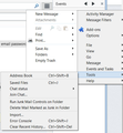
Use the AppMenu button and use Options that is shown right below Add Ons in your image. Hover your mouse over Options and then click Options when the second menu appears.
Personally I turned the Menu bar back on so all the help instructions matched what I see.
You're not using the traditional menu being used in the example screen shots. You're using the awful new Application Menu button. Look under Options instead. Hover, don't click.
Oh, and +1 to Airmail's post.
由Zenos于
ok. got it. Thanks! i didnt know about the older menu. I'm new to TB. I like the old one better
boudreaupaul99 said
ok. got it. Thanks! i didnt know about the older menu. I'm new to TB. I like the old one better
All of us doing support prefer the old style menu system I think. IT more closely aligns the OSX, Linux and Windows versions as well.
Yes, I'm with Matt. I much prefer the old menu.
A particular issue with the new menu is that in certain places, if you click you get one result, if you hover you get another. I can't see any obvious indicator for where this option might apply, and it's very tedious having to explain this and give advice when to hover and when to click. I recall working with someone who habitually double-clicked everything and it took a while to train her not to do this. The nuances of hover/single-click/double-click can easily be overlooked (but may be intuitive to those who like "gestures").
And then there is all that stuff hidden incomprehensibly behind "New Message". Bah!
+100 %

