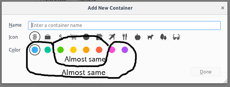
New color scheme for containers is hard to distinguish for color blind people
I heavily use containers to manage dozens of accounts for projects I'm working on.
Unfortunately, the color scheme has changed on Firefox 57, and it became harder to distinguish each container's color.
There are eight colors in the new scheme. For me, it looks like as if there were two types of colors in it: blue-ish and red-ish. What is worse, a red-ish color sometimes looks like a green-ish color. And each color starts to change its own color at its own pace. I have to gaze and concentrate just to find the desired color.
I know I'm a typical color blind person. And I also know there are better color schemes to handle the issue. I hope this issue is fixed on the following release. Meanwhile, it would be awesome if there's a workaround for this, such as replacing these colors by modifying a configuration file.
Tất cả các câu trả lời (1)
I suggest you create a bug report here: https://github.com/mozilla/multi-account-containers/issues .


