How to stop search results displaying in alternating colors
This userChrome.css content stops Thunderbird alternating colors when displaying the folders:
- folderTree > treechildren::-moz-tree-row(odd),
- folderTree > treechildren::-moz-tree-row(even) {
background-color: #333 !important;
}
What does the same thing for search results?
I've just started using TB (52.5.2 (64-bit)) and it won't load the DOM inspector so I can't find out for myself.
Solução escolhida
Thanks for that!
This is what I ended up with in userChrome.css:
@namespace url("http://www.mozilla.org/keymaster/gatekeeper/there.is.only.xul"); treechildren {
    color: white !important;
    background-color: black !important;
    font-size: 16px !important;
} treechildren::-moz-tree-row(odd) {
background-color: transparent !important;
}
- folderTree > treechildren {
    background-color: #333 !important;
    font-size: 12px !important;
}
It's not eye-candy but I can read it comfortably. BTW: that is a hash before "folderTree"
Ler esta resposta no contexto 👍 0Todas as respostas (13)
I'm using default system and Thunderbird does not display in alternating colours in Folder Pane or anywhere, so I'm a bit perplexed as to why you have the issue in the first place.
re :I've just started using TB (52.5.2 (64-bit)) the latest version is 52.6.0
What OS do you use?
Did you get the program from here: https://www.mozilla.org/en-US/thunderbird/all/
What theme are you using?
An image may help explain situation.
What search method are you talking about? eg: Quick Filter? Global Search ? Menu icon > Find > Search Messages ?
I'm using Thunderbird from an up-to-date Fedora 26. I'm not using a theme.The search was Edit > Find > Search Messages.
Thunderbird only gave alternating colors when I put this:
treechildren {
    color: white !important;
    background-color: black !important;
}
in userChrome.css.
peterscott said
I'm using Thunderbird from an up-to-date Fedora 26. I'm not using a theme.The search was Edit > Find > Search Messages. Thunderbird only gave alternating colors when I put this: treechildren { color: white !important; background-color: black !important; } in userChrome.css.
I suggest that the fedora folk may well be feeding you a customized theme. It is not uncommon in Linux distributions.
Why go to the trouble of hand crafting custom CSS when there are themes that do it for you and in many cases are more attractive than the default Thunderbird look. This for example has caused some excitement in the Linux community. https://addons.mozilla.org/en-US/thunderbird/addon/monterail/
Not sure if the Developer Tools is on the tools menu in release versions, but if it is, use the Developer Toolbox ctrl+Shit+I)
I don't think Fedora are giving me a theme -- it was too plain.
I'm not looking for eye-candy. My eye sight is not as good as it used to be and I simply want to get white text on a black background.
This was easy to do but, to complete the job, I just need the CSS selector for the lines in the search results.
I don't get alternating colours in the search results window, in either Windows 10 or MX-Linux/Mate. Whilst I do have userChrome.css and userContent.css files, neither is configured to either apply or eliminate striping.
I am with Matt, in that you probably have some non-default theme or adjustments at work.
The Developer Tools feature is indeed in place here (Windows 10 Pro) on TB 52.6.0 and it seems to allow me to investigate the formatting. IIRC, it uses Firefox to provide the UI; there is a warning about some external software being given access to Thunderbird. I don't know what happens if Firefox is not installed.
The search results window is messy because it appears to contain a separate rule for each of the possible columns in the results part. So you'd have many instances of the odd and even settings, if they have been set to alternating in your particular distro's version.
Thanks. I'll install the very latest TB and see what happens.
However, before I do that: I did install some themes and remove them. I didn't try any smart stuff -- just used buttons. Is it possible they are lurking around? Could they carry over to the new installation?
Well, I erased Fedora's Thunderbird; I installed 52.6.0 directly from Mozilla and I deleted my .thunderbird directory. Then I set up a userChrome.css containing:
@namespace url("http://www.mozilla.org/keymaster/gatekeeper/there.is.only.xul");
treechildren {
    color: yellow !important;
    background-color: blue !important;
}
(I went for yellow and blue to see if there was anything special about my preferred white on black.)
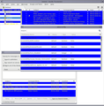
You can see the result in the uploaded image. (The striped windows are the config window and the search mails window.)
So, I still need the CSS selector for the lines in the search results. But I now need one for the lines in the config window.
The good thing is the Thunderbird from Mozilla has the development tools so, given time, I will be able to work out the selectors.
I've had a read of some 'bug reports'. Back in the dark ages, the stripes were default, but some time ago they were deliberately removed, so they should not be present in the current versions. See info here where comment 2 and 3 discuss complete removal of stripes to irradicate a different but related issue.
however, read comment 4: Created attachment 682752 [details] [diff] [review] patch Changing the background-color from -moz-oddtreerow to transparent removes the zebra striping. Removing the three #threadTree > treechildren::-moz-tree-row() rules from mailWindow1.css lets affect the rules from toolkit and the stripes are back again
This info discusses 'zebra striping' which was around back in eg: version 2. There is some info on removing stripes which corresponds with the info in comment 4 about use of 'transparent'
Must admit, it really sounds like you have something overriding settings; something from the past; but hopefully this info may help resolve issue.
Solução escolhida
Thanks for that!
This is what I ended up with in userChrome.css:
@namespace url("http://www.mozilla.org/keymaster/gatekeeper/there.is.only.xul"); treechildren {
    color: white !important;
    background-color: black !important;
    font-size: 16px !important;
} treechildren::-moz-tree-row(odd) {
background-color: transparent !important;
}
- folderTree > treechildren {
    background-color: #333 !important;
    font-size: 12px !important;
}
It's not eye-candy but I can read it comfortably. BTW: that is a hash before "folderTree"
Put in a leading space and your hashes and asterisks will not be transformed into bullet points, and your text will be shown in monospaced font.
@namespace url("http://www.mozilla.org/keymaster/gatekeeper/there.is.only.xul");
treechildren {
   color: white !important;
   background-color: black !important;
   font-size: 16px !important;
}
treechildren::-moz-tree-row(odd) {
   background-color: transparent !important;
}
#folderTree > treechildren {
   background-color: #333 !important;
   font-size: 12px !important;
}


