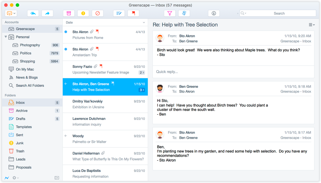
Thunderbirds sucks - no fat stacked view for messages (default everywhere else), ugly tabs, slow when syncing. How can you still ignore these UX issues?
I don't mean to be rude (but this will be) - and Thunderbird is a feature rich product which is highly extendable, but your product is broken from a work flow / UX point of view - I want to use it again, but it sucks. The industry standard for email is a horizontal three pane view (some call it a wide view). One column for your inboxes, one for your messages and one for viewing the message vertically, on one half of the screen (e.g. Postbox). After being in existence for nearly 15 years, the fact that you are unable to support the most popular and standard view across the industry is ridiculous and nonsensical to the point of being ideological in your resistance to it.
The tabbed view across the top of the product is awful to use and looks awful - it makes Thunderbird feel like a web browser and ruins the cohesiveness of the client - if people want tabs give them that option, but in email most don't, they look horrid.
The Thunderbird sync engine is painfully slow - i'm not a programmer and TB is open source - but other products sync well and fast, your doesn't (it does at least, do a very good job at sync, and if watching paint dry is your thing...).
The Thunderbird interface is cluttered, outdated and beginning to look ugly - the plugins don't streamline the experience, they over complicate it (there's no more than a dozen truly useful plugins - the rest are distraction ware).
+ Where's the gmail style conversation view for email?
The address book is basic and looks awful and there is no plugin replacement for it.
The calendar is almost there (and very useful) - but never truly finished in terms of how it looks.
Exporting email and backing it up is also lots of hard work (thankfully most of the world now runs on imap now).
Apart from the fact that Thunderbird handles email very very well - Thunderbird sucks.
Thunderbird should be the only email client and be the one that rules them all - but you guys dropped the ball as you never got the basics right and ignored important problems and user complaints every step of the way through development.
Every new release there are tons of new added features that mean nothing - as your whole email concept is broken, your paradigm is flawed.
The reason why people use Thunderbird now is because they don't have a better option.
Are you going to do something about this - or are you going to let your product die a slow death once someone comes up with a more reliable and comparable replacement?
Your last foothold is Linux - once someone does something better in that corner (with the exception of the only the most dedicated), your market share will die.
All Replies (2)
There is a wide view. You can't have looked hard for it.
Ugly? Change the theme. Ugliness is in the eye of the beholder.
Conversations? There is an addon.
I don't like tabs either, but you don't have to use them for reading email. Again you would appear not to have investigated the settings available to you.
Slow? Unfortunately, yes, maybe. But for me being able to use the same email client on two different OSes outweighs this disadvantage.
I wouldn't like what you seek, nor am I particularly happy with the default appearance, so I am grateful for addons to allow me to personalize it to my taste. Since you have dismissed addons out of hand, then maybe you'd better move on. Nothing for you here.
Tabs is clearly a matter of preference. Some people hate them. That's fine.
But the majority of users and mail product use them. Even gmail in recent years has added tabs in the form of different views into the Inbox
> Every new release there are tons of new added features that mean nothing - as your whole email concept is broken, your paradigm is flawed.
I hesitate to ask - what "tons of added features" the last two releases (38 and 45) do you take exception to?

