Can barely see outlines for text entry boxes on some sites
Hi. It's hard to see where to enter text on some sites. How do I make text entry boxes easier to identify please?
For example, I had to look hard to figure out that there's a text entry box on the following page around the words Share an Update...
Alle svar (7)
Can you attach a screenshot?
- https://support.mozilla.org/en-US/kb/how-do-i-create-screenshot-my-problem
- use a compressed image type like PNG or JPG to save the screenshot
Make sure you haven't enabled High Contrast mode in the OS settings. Make sure you allow pages to choose their own colors.
- Settings -> General -> Language and Appearance -> Colors -> Manage Colors
"Override the colors specified by the page with your selections above"
Try "Never" if the default "Only with High Contrast themes" isn't working.
Thanks. I already selected Never and the problem remains. Looks like disabling high contrast mode is the same as choosing Never.
I attached a screenshot below.
I can only check the login page that I get if I click the link you provided and that gives a grayish background color to email and password fields.
Thanks for checking the login page. That was nice of you. Guess I'll just live with it.
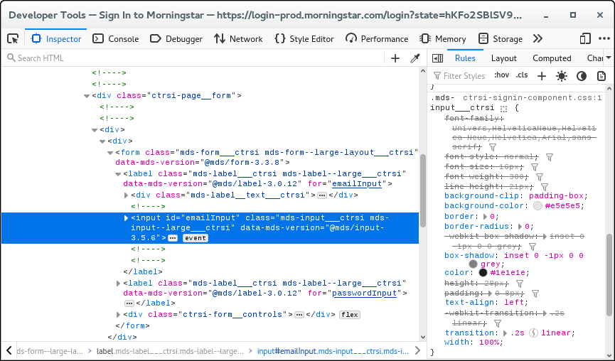
How do those fields that do not have a background show in the Inspector ?
It is possible to fix/override CSS rules via a userContent.css file, but that requires to know a unique ID or class name to select such a filed.
You can right-click and select "Inspect" to open the built-in Inspector with this element selected.
Thanks for the information. After I opened inspector, the text field showed with more contrast, like it was faintly highlighted in pink. Thanks for the tip.
what you can do is install an extension its called dark side extension i think it makes your pages darker which makes you see text boxes easier it solved my problems


