Layout View
HI,
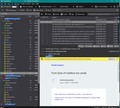
I am trying to get my email message list to have the same vertical view as I did with Outlook instead of the spread-out view that Thunderbird uses as default. I wanted this compact so I can view the message in a larger window in vertical view. I have a screenshot with two examples. The top portionos Thunderbird and the bottom is Windows Mail (I didn't use Outlook as I uninstalled it, but the format is nearly the same view in WM). To read the subect/sender I have to drag that column to the left to see the contents and it's off-putting. The left column in WM with message windos is the view I want.
Thnx, Tom
การตอบกลับทั้งหมด (9)
You might find the Stacked View option in More Layouts is adequate.
The type of 'multi-line view' with the Subject under the sender is currently only available in Betterbird.
Thnx for the reply!
This doesn't give the desired view on any setting (unless I am doing something wrong). The message pane list really only needs to allow word wrapping somehow. I am really liking Thunderbird, but this makes view that list really difficult.
I am just wanting to get away from using Outlook as my emails client and I really loathe using online formats as they do not allow to have multiple email addresses to view. When it comes to functionality, just like this part, Outlook is hard to be beat, but their tech support doesn't exist and will not answer simple question even though I am a Office365 subscriber.
Thunderbird comes closest to these in functionality, especially for a free client, it's impressive.
Anyway, any other suggestions or can this be added as a suggestion for changing Thunderbird?
Thnx, Tom
Vertical View is ideal if you have a large wide screen. Then there is plenty of space to easily read the 'Subject'. See my image below.
But if your screen is not as wide then 'Classic is the best option - see second image I use this as it is the most convenient.
If you use the addon 'MoreLayouts' as mentioned by sfhowes then you could try the 'Wide Thread view' Menu app icon > View > Layouts > Wide Thread View- see third image as example.
เปลี่ยนแปลงโดย Toad-Hall เมื่อ
The idea of multi line for a subject has been posted before by people who previously used Outlook, but the Thread Pane view - one email per line is not going to change.
Personally, I used Outlook years ago and I found it harder to read multiple lines. What really aggravated me was the fact I had to do so much scrolling. Only a few emails were visible and the odd one with a crazy length of subject would hog space.
Thunderbird it has it's own individual look and feel. Try out various settings and see what suits a better reading view on your screen. You can move columns and panes using the section splitters. It did not take me long to appreciate a different view was actually better. I could read it easily and show a lot more information. I just had to get used to it.
As you can see by the various images I posted, there is no problem reading the Thread Pane -Subject. It is a question of choosing the best Layout view for your size of screen/monitor.
Hi Toad,
So this view is permanent and that's official? Also, in relation to your previous post as well, I do have a wide screen. But that doesn't mean that your own experiences are of what other experience as well. Your preferences are subjective to your liking. I have vision issues and for decades now I have used that view, so I am accustomed to read it is such a way that it's wrapped. No different than reading webpages or even books. Plus the fonts are larger in wrapped form. To say that "As you (meaning me) can see by the various images I posted, there is no problem reading the Thread Pane -Subject.", when that is an issue for me reading small fonts. It always good to never project one's own experiences or preferences as that being of another's as well.
To date Thunderbird is the only email client I've used not to have that wrapped view. Considering by your own words that people have posted this subject before, I would think this owuld be a simple change to make those view optional (like other email clients).
Tom
It would seem the issue about wanting to break up a short sentence over more than one line is all about 'it uses a bigger font', so that means it is not about breaking up a sentence over more than one line - it is all about the readibility of font size.
re : I have vision issues.... there is no problem reading the Thread Pane -Subject.", when that is an issue for me reading small fonts.
I can help you with sorting that problem out. You should not need to struggle to read the 'Subject' or anything, so try the following information to make the general readibility more suitable for your needs.
General font size throughout program including Folder Pane, Thread Pane, Menus etc.
In version 91*
- click on 'Menu app icon' - icon has 3 lines
- click on 'Preferences
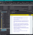
First images shows what you see after selecting 'Preferences'
- click on 'General'
- Scroll to the bottom
- click on 'Config Editor' button.
- You will see a friendly warning - accept the risk.
Second image top half shows where to type and what to look for
- In search type : pixels
- look for this line: layout.css.devPixelsPerPx
the default is a negative value: -1.0
- click on the pencil icon to edit the value
Second image bottom half shows where to alter data and how to save it:
- You can try typing a positive value such as 1.20 or 1.25 or 1.5 or 2.0
- click on the tick icon to save your entry.
Image shows I typed 1.5, but if too big then go back and try 1.25 Do not type larger than 2.0 because you may start to have other problems which can be fixed but are not so straight forward.
Once you have obtained a much easier to read Thunderbird, then you find it easier to use.
Please note: The images I posted in the forum question can be made much bigger - a single left click on image will open it up so you can see the information.
I have the exact same request as Tom. From my quick searches on support, this request goes back 17 years.
I don't have a bugzilla account, otherwise I'd create a new feature request for multi-line view.
I've tested many email clients and I can say that all other clients have multi-live view (for Windows at least). It appears that there's zero interest in making the Thunderbird GUI modern like every other email client.
Why is it important, because I use a laptop with a 10" screen and another with a 13" screen. Multi-live view is very important for making use of landscape limitations on laptops. Yes, I have monitors too but after work or on weekends, I'm 100% laptop and phone. I'm sure this is pretty standard for most users.
I tested around 10 email clients and I keep coming back to Thunderbird for one reason. It's the fastest MAPI client for Windows I can find. I even tested Betterbird but it's beta and has other issues so I came back to Thunderbird.
I donated today so I hope that helps.
Let me know if I should create a new feature request in Bugzilla.
Thanks for your hard work.
I can agree with you, there is no real interest to emulate Outlook and it has nothing to do with being 'Modern'. People use Thunderbird because it is not Outlook. Outlook does not offer the variations Thunderbird offers and it has no intentions to do so. Thunderbird uses have more flexibity with the program in general than perhaps most other email clients.
Multi line view uses more vertical real estate per item and displays less items. It would also be a huge undertaking from a code point of view and unlike Microsoft, there is no massive income which can be spent on employing people to create what anyone can use if they use Outlook. In Thunderbird, you can use so many variations when reading emails and the addon I mentioned offers even more variants.
For those people who are challenged with the width of their screens. Using the addon previously mentioned and set up to use View > Layout > Wide Thread view
This puts the thread pane across the top so it is plenty wide enough to read clearly, so multi-line is never required. As you would be happy to see less items like Outlook, it means you can raise the height of the Message Pane to see alot more content of emails. The Folder Pane is in same location on the left, but is now positioned below the Thread Pane. I've deliberately made the window much narrower. It is now less than half of my screen. See image below. It now offers a very wide Subject etc area so easy to read. Full access to Folders. See how easy it is to read the email comment.
Yes it is the most recent version of Thunderbird 91.10.0 - do not get fooled by the folder icons in Folder Pane - I did say you can do all kinds of modifications in Thunderbird. I've also got the 'Folder Pane columns' enabled as well, if I removed it then there would be even more space for displaying the email.


